Introduction to CSS
CSS (Cascading Style Sheet) is the code that determines how your web pages will look. It defines elements such as layout, colors and fonts. In this walkthrough you will learn what CSS is and how to use CSS selectors and styles with a WordPress theme.
Prerequisite Skills
Students taking this module will want to have some basic familiarity with the following
- installing and activating WordPress themes
- installing and activating WordPress plugins
- Basic understanding of HTML
Assets
- Twenty Twelve theme
- Sample XML file – XML import file
- Sample Images (.zip) – Have students add to the Media Library
- Jetpack plugin (+ activate Custom CSS module)
- Online Color picker tool
Screening Questions
- Are you familiar with installing and activating themes via the WordPress Dashboard?
- Have you used the tools found under the “Appearance” tab in your dashboard to customize your theme?
- Do you have at least a basic knowledge of HTML?
- Will you have a locally or remotely hosted sandbox WordPress site to use during class?
Hands-on Walkthrough
What is CSS? What does it do?
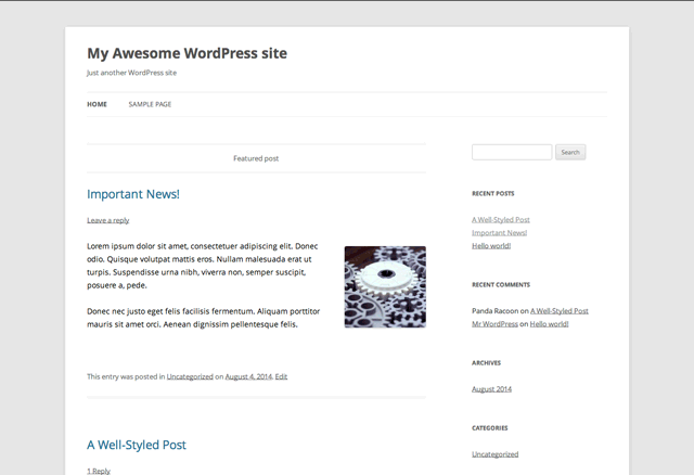
Welcome to Intro to CSS! Today you are going to learn how to alter the “look and feel” of your WordPress Theme by modifying its existing Cascading Style Sheet (CSS) file, as well as write a few new styles of your own.
In practical terms, the code found within your theme’s CSS file determines the appearance of your site by applying style rules to HTML content, which has no style of its own.
One way to visualize this is to think of your site as an HTML “mannequin” and CSS as the “clothing” you put on it. Just like a mannequin’s clothing, you can change the CSS of your site any time you like, without altering its underlying HTML structure.
For example, with just a few lines of CSS (and a few image files) we are able to turn our site into this:
Learning the Lingo: Selectors, Properties, and Values
Like any foreign language, CSS can be made easier to understand by breaking down each “sentence” into it’s individual components. Here is an example of a common CSS declaration, as well as a diagram of what each CSS component is made of:
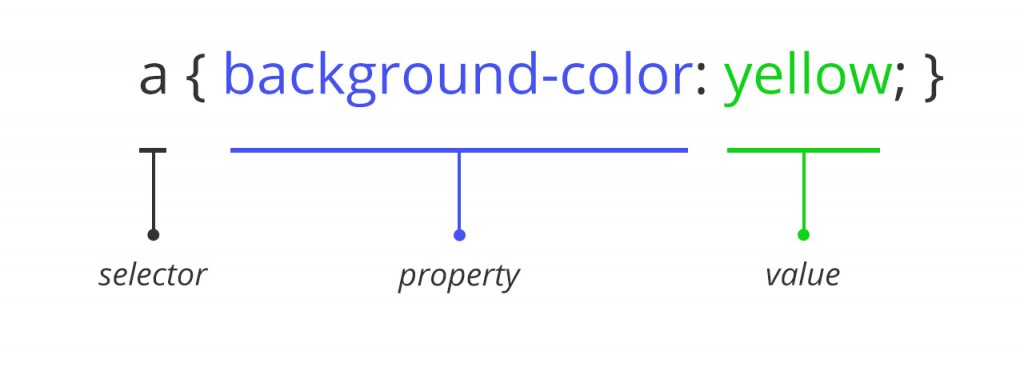
Because our plan is to find and modify the existing CSS of our theme, this will help you to better understand what is going on:
- Selector – The thing you want to change
- Property – What you are changing about it
- Value – What you are changing it to
How to Edit Theme CSS the Right Way
It is technically possible to locate and edit the existing CSS file that is hosted on your server, but this is a bad idea. The reason is that when an update to your theme happens (either to release new features or to improve security) any changes you make to the existing style sheet are overwritten by the update, erasing your hard work.
There is a way around this: use a plugin that keeps your changes safe from updates. We will be using a plugin called “Jetpack” to accomplish this task. Jetpack functions by leaving the theme’s existing CSS untouched while inserting your modified style rules before rendering what is seen in the browser.
Finding Your Theme’s Styles
We are going to focus on modifying styles that are already there, rather than writing our own CSS from scratch. In order to change an existing style, you have to find it first. This can be done by using the developer tools that are already built into your web browser. We will be using Google Chrome for this workshop, but most modern browsers offer similar tools.
It’s important to note that when using the inspector, you can edit the CSS of your theme, but not the HTML. That is because the HTML you see in your inspector is dynamically generated by PHP, and is not something you can directly edit. That’s OK though, because you can do a lot with CSS to modify your site’s appearance, as you will see in the upcoming exercises.
Exercises
Exercise 1 – Modifying Fonts
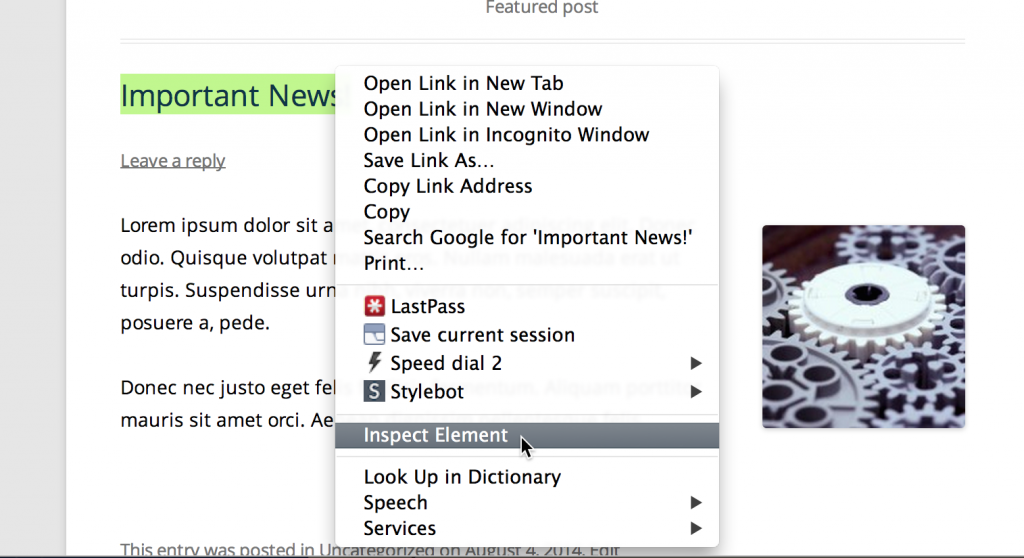
For this exercise, we will be making changes to the blog title text found at the top of blog articles on your site. To locate the CSS for this element, right click on any blog title on your test site’s home page. Next choose the Inspect Element option, which will launch your browser’s developer tools.
In the panel below you will see a split view, with:
- Site HTML on the left with the element you selected highlighted
- CSS rules on the right that apply to that selected element on the right.
- Above is your website, where you can see your changes previewed live
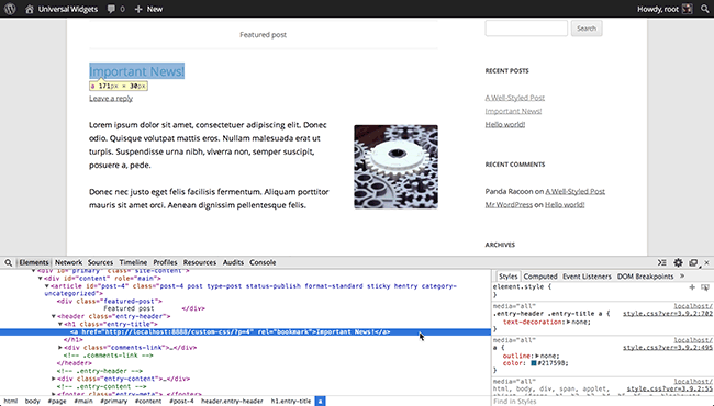
If you were careful in where you placed your cursor, you should see the HTML starting with
This is because blog titles are just big links, and by default your browser is set to underline all links, including titles like these. So in this case, the theme author added this CSS declaration to override this browser default.
Let’s re-select it again in our inspector to activate this declaration again, as the title does look nicer without an underline. But it would be nice if we could also change that declaration to add a few more styles of our own, such as making the titles bigger.
To add our own styles, click on the blank area under the text-decoration property, then enter a custom property called: font-size
You will notice as you start typing that the inspector will auto-suggest matching properties which you can select.
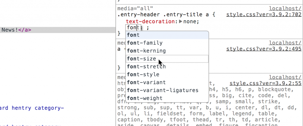
Once you have entered font-size property, hit the tab key on your keyboard to enter a value for this property.
There are a few different ways you can specify this size, but let’s go ahead and use pixels, which is easiest to understand. Enter a value of 40px.
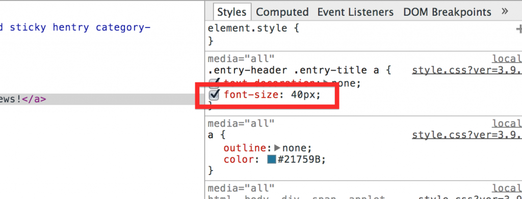
Now you will see in the preview that the size of your titles are much larger. If you wish, you can experiment and pick any size you want by entering a new value for font-size in the inspector.
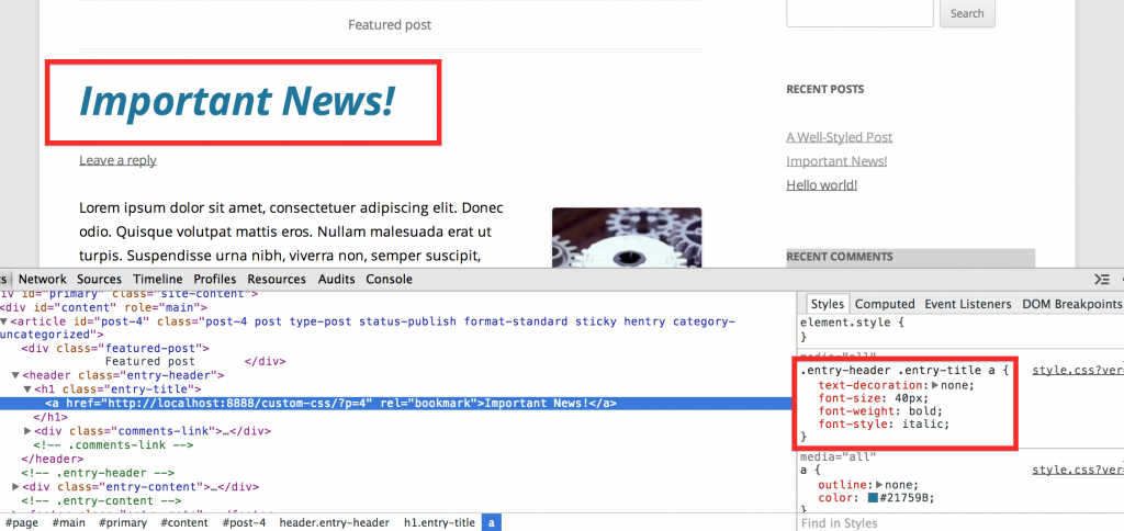
While we are here, let’s go ahead and add a new declaration for
font-weight: bold
and also add a new declaration for
font-style: italic
When you are done, your blog headings should look something like this:
The great thing about using your browser’s inspector tool to modify CSS is that it is a great way to see what you are doing as you are changing it. However, if we were to reload the page, all our changes would be lost. That is because we are not actually modifying the site, but the CSS that is displayed by the browser.
Saving our changes is easy, though. All you need to do is highlight the modified CSS in the inspector, and copy it to your computer’s clipboard.

From here, go to your Dashboard, and navigate to Appearance > Edit CSS and paste in your first lines of custom CSS. When you are done, save your changes, and visit the home page of your site, where you can see your custom styles have been applied.

Exercise 2 – Background Colors and Padding
One way that you can take advantage of CSS to customize your site is to apply styles specifically to features that are common in WordPress, like Sticky Posts. A Sticky Post is meant to stick to the top of your blog page, rather than staying in date-order with your other posts.
You can often find them being used to make an announcement, or to keep content that is important (but doesn’t change often) prominently placed on the website.
Let’s use CSS to style our Sticky Post to give it a different look when compared to the standard blog posts on the page. If you are using the sample XML import file provided for this workshop, the topmost post titled “Important News” is already set to be a Sticky Post. One hint is the set of double borders and “Featured Post” heading above the title for the post, which is something the theme author added to this theme to display with Sticky Posts.

Start by hovering your cursor over “Featured Post” and and right-clicking on it to inspect that element. You should see div class="featured-post" highlighted in the HTML pane, and see .article-sticky .featured-post in the CSS pane.

We are going to be doing something else to our sticky posts, so hide this feature by simply adding the following rule:
display:none
This causes the “Featured Post” element to no longer be displayed. Again, because this change is only made in our inspector, we will need to copy this into our CSS editor in the Dashboard. Unlike last time though, we can simplify this to only include the rule we added, like so:
article.sticky .featured-post {
display: none;
}
Doing this keep our custom CSS from getting too bloated. Since the other styles for this element are already in the theme’s CSS, we only need to add our custom declaration.
Now, going back to the inspector, let’s style the Sticky Post itself. First you will need to find and highlight the long line on the HTML pane in the inspector that says:
article id="post-4" class="post-4 post type-post status-publish format-standard sticky hentry category-uncategorized"
This is the HTML element for our sticky post, and you can see this by reading in the line above that “sticky” is one of the classes given to this element.

However, you will notice that when you highlight this line of code, there isn’t any matching CSS we can use to style this sticky post. The only one displayed is .site-content article when ideally we would be looking for a style with .sticky in it.
We can use the inspector to add new styles to our site though, and to do that, with the article markup still highlighted in the HTML pane, click on the “+” button at the top of the CSS pane to add a new style.

You will notice that when the new declaration is created in the inspector, it shows the selector as:
article#post-4
However that is not quite what we want. If left as-is, this style rule would only apply to articles with an ID that is equal to “4” which is the exact post we are on, as it is the 4th post we have created on our test site.
In this case, we will need to create a new style declaration on our own, rather than use one that exists already.
We can get around this by modifying the selector to instead say article.sticky which, in plain English works out to something like “Apply this rule to all articles that have the class equal to “sticky” which means this post, plus any sticky posts we make in the future.”

ID vs. Class
You may notice in the above example, some selectors have a “#” in front of them, and some have a “.” in front of them. This is used to denote if there is an ID or a class associated with this HTML element. Let’s look at the original HTML that was highlighted in our inspector:
article id="post-4" class="post-4 post type-post status-publish format-standard sticky hentry category-uncategorized"In this case, you would add a “#” in front of
#post-4because in the original markup it appears as id=”post-4″ whereas we added a “.” in front of.stickybecause it appears asclass=”sticky” in the original markup.
Now that we have created our new selector, let’s add some styles to it. Start by applying the following background color:
background: #D0EAF3;
Notice that when you add this style to the inspector, the sticky article is given a light blue background.

If you want to experiment with the color a bit, you can click on the tiny swatch next to the hex code #D0EAF3 which will bring up a color mixer tool.

As is often the case, modifying one thing in CSS often leads to needing to modify other things. Since the Sticky Posts for this theme were never designed with background colors in mind, the text appears to be right at the edge of the “box” now.

A “box” is a good way to think of this, as blog posts (and most things on a web page) are in boxes whether you see them or not. By adding a color to it, we have made this box visible, and now we could use some extra room so the words don’t feel like they are against the edge.
We can do this by adding padding in exactly the same way you might add extra padding to the inside of a box when shipping something across country. Add this to your article.sticky declaration:
padding: 20px;
Your sticky post should now look something like this:

As with last time, be sure to copy the CSS from the inspector to your computer’s clipboard, then navigate to Appearance > Edit CSS and paste in your CSS. It should look something like this.

When you are done, save your changes.
Exercise 3 – Adding A Background Image
In the last exercise you were introduced to the background property in CSS, which allows you to change attributes of the background of any element. In the case of our Sticky Post, we used this property to change the background to a soft blue.
You can also use the background property to display an image. To demonstrate this, we will add a background image to our site.
To get started, hover your cursor over the white space to the right of the site title in the header, and right-click to inspect the element. In your browser inspector, you should see the following line of HTML highlighted:
div id="page" class="hfeed site"
You will also notice that in the CSS pane the first style visible should target the body .site element. To this, add the following declaration:
background: url('');
At this point, you should notice something has gone very wrong, as now the body .site has no background color at all. In fact, the element is now transparent, and we can see the grey of the site background instead.

This is because we have overridden the CSS for the white background, which was set elsewhere in the style sheet, with a new CSS rule that is more specific. We’ll fix that later, but first let’s add an image.
As it stands right now, we have added the syntax to add an image when we added
background: url('');
and you can probably guess that what we need to add next is a URL to an image.
The image we use can be any image that is hosted on the internet. The easiest way to do this is to upload an image to the Media Library on the site, which will automatically create a URL that we can use in our CSS.
Go to Media > Library in your site’s Dashboard, and if you are using the sample import (XML) file for this workshop, you should see an image called
page-bg
that has been uploaded automatically for you. This image was created specifically for this workshop, but any image will work if it is large enough. To use this image, click on it in the Media Library and copy the image’s File URL (including the http) from the image details to your clipboard.

You can now add this URL to the rule we started in our inspector window, within the single quotation marks. Your style should look something like this, though your tests site will use a slightly different URL:
url('https://atlantawpcoach.com/wp-content/uploads/page-bg.jpg');
Now you should see that we have an image on the page’s background, and if you scroll down you can see that it is repeated on the page.

Since the graphic is designed to fade to white, let’s fix this repeating problem by adding the following to our rule:
background: #FFF url('https://atlantawpcoach.com/wp-content/uploads/2014/08/page-bg.jpg') no-repeat;
This accomplishes two things: it forces the image to be displayed once instead of repeated, and also restores the white color we had in the background originally by using the hex code for white, which is #FFF.
Your site should now look something like this.

Background images like this can do a lot to customize the look of a website, as you can see.
One other place where images can make a big difference is in replacing your site title (found in the header) with a logo or other graphic.
Go back to Media > Library in your site’s Dashboard where you should see an image called
logo
Click on it in the Media Library to view the image’s details, and copy the File URL to your clipboard.
Next return to your browser, hover your cursor over the site title in the header, and right-click to inspect that element. You should see the following line of HTML highlighted:
a href="https://atlantawpcoach.com/..." title="Universal Widgets" rel="home"
The URL and site title will be different, based on your test site, but you should see similar markup. We know from customizing the post titles in Exercise 1 that the a element is a link. This is the case here as well, as the site title is a clickable link that will take you to the home page from anywhere on the site.
In this case, we want to add a logo in place of the text, so locate the CSS rule in the inspector that says:
.site-header h1 a, .site-header h2 a
Add the following declaration, using the file URL for the logo file in your Media Library:
background: url('https://atlantawpcoach.com/wp-content/uploads/logo1.png') top left no-repeat;
You will recognize this CSS as being similar to the rule we used to add a graphic to the page background of our site, but instead we are using the URL for our logo graphic. We are also adding some declarations to position this image in the top left of the .site-header element, as well as no-repeat to make sure the graphic appears only once.
However, as with the page background graphic we used earlier, we will need to add a couple of rules still before it will work correctly.
First, let’s eliminate the title text so we can see the graphic better. In an earlier exercise we used the display: none; declaration to hide an element on the page we did not want to see anymore, but in this case we want this link (which is also the title of your site) to be “visible” to anyone who is visually impaired and uses a screen reader to surf the internet. Search engines also look for this title, so setting it to display: none; would affect the usability of our site. However, we can use the following declaration to move the title off-screen in a way that won’t affect anyone negatively:
text-indent: -9999px;
This moves our text off the screen by such a large amount that it would never be visible in most situations, but can still be found by screen readers and search engines.
The last thing we will need to do is to enlarge the size of our “box” that holds the logo image. Because it is in the Media Library, we can always view its details to see its dimensions:

In the case of our logo, adding the following declarations will expand the size of the our logo graphic:
height: 100px;
width: 440px;
You should now be able to clearly see the entire logo graphic in place of the site title text that used to be in the header.
Be sure to copy the new style rules from the inspector window so you can add them to your custom style sheet at Appearance>Edit CSS. As before, you don’t need to duplicate any existing CSS declarations, just add your own. The style you will be adding should look like this:
.site-header h1 a, .site-header h2 a{
text-indent: -9999px;
background: url('https://atlantawpcoach.com/wp-content/uploads/logo1.png') top left no-repeat;
height: 100px;
width: 440px;
}
Save your changes, and return to the home page of your test site.
The last thing we will need to do to complete our transformation is to hide the site tagline, which is still visible below our logo. Rather than go into the site’s Dashboard and remove it in Settings (which will also remove it from screen readers and search engine results) we can use the same text-indent selector to safely move it off screen using CSS.
To do that, in the HTML pane in the inspector, highlight the h2 class="site-description" element, and add the following declaration to the h2.site-description rule:
text-indent: -9999px;
You will now see the site tagline hidden as well, with only the logo remaining in the header.

Copy the new style rules from the inspector window to your custom style sheet in the Dashboard. The style you will be adding should look like this:
h2.site-description {
text-indent: -9999px;
}
Finally, save your changes, and with that our transformation of this site is complete. All of the CSS changes you have added to your site should look something like this:

Quiz
You can use CSS to:
- Tweak and make small changes to your existing theme’s appearance
- Add new styles that don’t already exist in your theme
- Change the entire look and feel of your website
- All of the above
Answer: 4 – All of the above
You can use your browser’s web inspector utility to:
- Create a new theme
- Preview CSS changes in real time
- Modify HTML and PHP
- Directly edit your theme’s existing CSS
Answer: – Preview CSS changes in real time
To save the changes you make in your browser’s inspector tool, you must:
- Refresh the page you are on
- Download an updated stylesheet from the inspector
- Copy the new styles to a CSS editor plugin in the Dashboard
- Nothing – Your changes are saved automatically
Answer: 3 – Copy the new styles to a CSS editor plugin in the Dashboard
You can use the background property to:
- Add a solid color
- Display an image
- Control how many times an image is displayed
- All of the above
Answer: 4 – All of the above